60-30-10 Rule
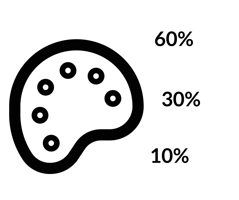
A simple recipe for colour that works: 60% dominant colour, 30% secondary, 10% accent. The result looks balanced, cohesive and never boring.
Stuck choosing colours for a room? The 60-30-10 rule gives you a recipe: 60% of the space in a dominant colour, 30% in a secondary colour and 10% in an accent.
Two quick examples:
Living room color schemePaint the walls a neutral beige (your 60%). Bring in a darker blue for the sofa and armchairs (your 30%). Then add bright yellow in the cushions, artwork or rug (your 10%).
Bedroom color schemeGo light grey for the walls and bed linen (60%), deep navy for the curtains, an upholstered chair or a rug (30%), and a pop of coral in pillows, picture frames or lamps (10%).
The big colour keeps things calm, the middle one adds depth, and the small one gives the room a spark without tipping it into chaos.
Walk into a room that feels effortlessly put together and there's a good chance its colours follow a simple ratio. The 60-30-10 rule, a staple of interior design, splits a colour scheme into three parts: 60% dominant colour, 30% secondary colour and 10% accent. Spread across walls, furniture, textiles and accessories, those proportions tend to produce a space that feels balanced rather than chaotic or bland.
The rule draws on, or echoes, several other ideas:
Color theoryThe study of how colours interact and how they affect perception and emotion (Itten, 1961). The 60-30-10 rule is applied colour theory: a practical recipe for choosing and combining colours so a design feels pleasing and balanced.
Gestalt psychologyThe school of thought that studies how we organise visual elements into coherent wholes (Wertheimer, 1923). The rule leans on Gestalt principles such as similarity and continuation, using repeated colours to tie a space together.
Fibonacci sequence and the Golden RatioMathematical patterns often found in nature and art and thought to contribute to beauty (Livio, 2002). The 60-30-10 split loosely resembles them, since it too aims for proportions the eye finds pleasing.
Visual hierarchyThe design principle of arranging elements by importance (Lidwell, Holden, & Butler, 2003). By clearly separating dominant, secondary and accent colours, the rule tells the eye where to look first and gives the room a sense of order.
For interior designers, architects or anyone repainting a spare room, seeing these connections explains why such a simple rule works so reliably.
References
- Itten, J. (1961). The Art of Color: The Subjective Experience and Objective Rationale of Color. John Wiley & Sons.
- Lidwell, W., Holden, K., & Butler, J. (2003). Universal Principles of Design: 100 Ways to Enhance Usability, Influence Perception, Increase Appeal, Make Better Design Decisions, and Teach Through Design. Rockport Publishers.
- Livio, M. (2002). The Golden Ratio: The Story of Phi, the World's Most Astonishing Number. Broadway Books.
- Wertheimer, M. (1923). Untersuchungen zur Lehre von der Gestalt. II. Psychologische Forschung, 4, 301-350.